Corporate web design is a huge industry and it is essential to companies to have a strong online presence. A corporate website has to confine to the main idea behind the company, its goals and purpose while maintaining its professionalism in order to obtain a solid impression to new visitors and existing customers.
A lot of business websites are created using WordPress today because of the power and flexibility of the platform. This have started a huge production of high quality business website templates for WordPress and all the features and user friendly layout help thousands of business owners world wide to maintain a professional website. I encourage you to go to our article about business themes.
The main purpose of corporate web design is to communicate information and trust to the visitors in a clean, direct and useful manner. A good website design for a corporate website should contain elements that will help depict the company’s goal. The elements has to work together perfectly including the logo, colors, typography, graphics and layout. These elements will let the customers perceive a company once they visit the website. For instance, dark color designs showcase the serious tone for a company and blue colors provide a feeling of trust.
Nevertheless, most of the large corporations have beautifully embedded these elements in order to clearly communicate the company, its products and services. Listed below are 30 creative corporate web design examples for your inspiration.
Campaign Monitor – MORE INFO

Don’t forget that you can make use of tabs or menus so that navigating through the website is easy to do and so that each visitor will know exactly where to go, what to click.
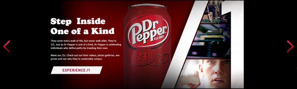
Dr. Pepper – MORE INFO

It always helps when a website is interactive because the website viewer is made to feel that he or she is a part of the entire experience. This ensures that each visitor remains interested.
Caffe Uno – MORE INFO

Food is one of the things that are the easiest to sell, mainly because everybody eats, and everybody enjoys good food. Boost the saleability of your products more by featuring what you offer.
Starbucks – MORE INFO

Incorporate videos in the website, not only for aesthetic purposes but also so that your viewers will be able to learn more about your products more thoroughly. This is a good alternative to the usual website texts.
One Hub – MORE INFO

Considering that this website is about web sharing, its presentation is pretty effective: no clutter, very minimal. One immediately notices that there is nothing in the website that is unnecessary.
Nest – MORE INFO

Nest has a very comfortable looking interface, one that successfully communicates being at home, being in one’s comfort zone. It is very laid back and makes use of muted colors.
Foehn – MORE INFO

Just in case you like something that looks bold, confident, and sure, this is one website that you can surely learn a few things from. It is able to balance out its boldness too.
M&M’s – MORE INFO
![M&M's[3]](/wp-content/uploads/2013/04/MMs3.jpg "M&M's[3]")
We all know this famous brand. It’s so famous that it actually no longer needs to promote itself. But one look at their website and you’ll want to run over to the store and buy their products.
NASA – MORE INFO

When I was a child, I always wanted to explore the outer space and see what was outside the earth. Opening NASA’s website brought back these wishes with its outer-spacey feel.
The 2020 Group – MORE INFO

What’s nice about this website is that upon opening the website we are immediately made aware that this is a no-nonsense site. But it is still able to look refreshing.
Aspir Terrassement – MORE INFO

This website looks very professional, that is one thing that really stands out about it. The elegant use of images adds to its unique look that gives that magazine-like feel.
Mitchell Adam – MORE INFO
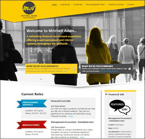
One of the easiest ways by which you can establish a name and leave an impression on the minds of the visitors is to create a color scheme that will stand out.
Peuegot – MORE INFO

Cars are, in most cases, especially in advertisements, considered luxury items. This is why it is very important that websites about cars communicate cool, elegant, and confident.
Own Mutually – MORE INFO

Simple will never go out of style. When I doubt, keep the design simple so as not to be overwhelming to the visitor. Most often than not, it is also easier to look elegant when the company website design is simple.
Space Milkshake – MORE INFO

As the website title suggests, you will see here snippets of information—basically Space Milkshake—that will enable the website visitor to have an idea right away what it is about.
Donor Tool – MORE INFO

This is a perfect way of catering to website visitors who might want to get answers right away or those who want to get to the topic that they really are in the website for.
Mail Chimp – MORE INFO

Corporate web design trademarks are very important. In this case, it is a monkey mailman. It makes the website look functional and pro productivity and at the same time comfortable and fun.
Alpidoor – MORE INFO

Have you ever tried experimenting with a website design that will allow web viewers to understand what it is about without having to make use of words? This corporate web design does that.
Iceberg – MORE INFO

One really creative and fun way to create corporate web design is to faithfully reflect the idea behind the website name on the corporate design inspiration. This way the connection is made very clear.
Mint – MORE INFO

You do not have to be wordy or over-explain just to make sure that your website is understood by your viewers. A line or two will suffice, as long as you choose the right words.
GE – MORE INFO

Technology is a, well, really technical thing. And so one would expect that a website such as GE’s would effectively look technical and professional at the same time. This website does it well.
Le Push Mail – MORE INFO

The wonderful thing about this website is that it is able to make something that is now very often associated with work (and stress?) and the office fun, light, and enjoyable.
Tolingo – MORE INFO

Perhaps what makes this website come alive is its use of pleasant colors that are easy on the eyes and are bright enough but are not so bright as to be an eye sore.
Harris Farm – MORE INFO

The design that this website uses is actually one of the most common designs: with a banner on top and columns underneath it. With enough creativity, even a common format will look unique.
Miro – MORE INFO

Just like what they did with this website, you need to simply pick something that you will feature on the home page and in the inside pages that will in a sense summarize what the site is about.
Postbox – MORE INFO

Postbox is simple and at the same time very much alive, with the use of dominant colors that make it pop out, in a good way. It also reflects the idea behind it very clearly.
Media Template – MORE INFO

Make use of darker shades for a professional look. Also, dark shades communicate the seriousness of the enterprise. If you want to convey the weight of your business, you might want to try this.
Host Riser – MORE INFO

One of the most noticeable features of this website is its slogan. Slogans also make it much easier for people to remember something, whether that be a website or something else.
Pixar – MORE INFO

What better or more effective way of showcasing the quality of your products or services than featuring what you have recently accomplished or those you are really proud of?
Evernote – MORE INFO

When your service is fairly and you think that people need to learn about it yet, take the initiative and educate your visitors right away on how to use it, why it is useful, and other aspects.
-

By: Andy
Hi my name is Andy. I’m founder and Editor in Chief and I love to research and write about inspiring and motivational topics for online entrepreneurs. Enjoy my articles and powerful tips about topics like WordPress, digital marketing and productivity. I am also a passionate blues musician and a family-man.
-


-
21 Powerful Tips to Grow Your Email List [Infographic]
Jkreativ Multilayer Parallax MultiPurpose Theme
Kingdom Responsive Multipurpose Retina Theme
